Colour Tests and Swatch Cards: A Practical Routine for Reliable Palettes
Why regular colour testing matters
Colours behave differently across papers, under layers, and as they dry. A routine of simple swatch cards helps you understand hue shifts, opacity, and mixing tendencies. Having a small, portable reference speeds decision-making during compositions and reduces the time spent second-guessing colour choices.
Make compact swatch cards
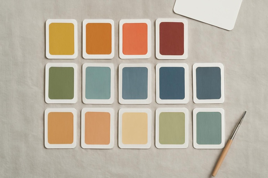
Cut uniform cards from the same paper you use for studies. Label each card with the pigment name, brand, and any mixing notes. Paint a solid patch of colour at a consistent thickness and allow it to dry. Over time, this small collection becomes a visual vocabulary for your palettes.
Test mixtures and greys
Alongside single-pigment swatches, create a set of mixes: two-colour gradients, tints with white, and neutral greys made from complementary pigments. These tests reveal how pigments interact and which combinations produce clean neutrals versus muddy results. Recording ratios (for example, two parts A to one part B) helps recreate desirable mixes.
Note opacity and granulation
Some pigments are transparent, while others are opaque or granulating. Include a small black line test before painting the swatch to assess coverage. Granulating pigments create texture that may be desirable for certain studies; note these behaviours so you can choose them intentionally within a composition.
Observe drying shifts
Many pigments change slightly as they dry. Photograph or observe a swatch immediately and again after several hours to see shifts in value or warmth. Make a small annotation on the card about the observed change—these notes help when you need predictable outcomes in layered work.
Create a portable reference system
Store swatches in a small binder or ring so you can quickly flip through them while working. Group cards by colour family or by the role they play in your palettes (shadow, mid-tone, highlight). A portable set means you can match colours quickly when working from observation or combining studies.
Use swatches as compositional tests
Before committing to a full study, assemble a few swatches into a thumbnail palette and check how they sit together. A quick arrangement of six cards can reveal unwanted clashing, overly similar values, or gaps needing a cooler or warmer note. This small rehearsal saves time and keeps the final piece visually coherent.
Maintain and update the archive
Periodically review your swatch collection and remove cards that no longer represent your work. Add new pigments as you experiment, and annotate older cards with renewed observations. Over months and years, the archive becomes a living record of how your palette preferences and material responses have evolved.
A modest routine of colour testing makes colour choices less uncertain and more enjoyable. The practice is small, visual, and cumulative—a material investment that pays back in clearer, more confident work.